Discover the True Size of Countries
Our website is a free interactive map tool that reveals the true size of countries on a Mercator projection map. While most traditional maps distort areas near the poles, this platform lets you visualize the real size of countries by moving them around and comparing them directly. Have you ever wondered if Greenland is really bigger than Africa? By exploring the true size of countries, you will quickly see how maps can trick your perception. This map is perfect for geography enthusiasts, students, and educators who want to understand the world in a more accurate way. Discover how the real size of countries differs from what you have seen in textbooks and online maps. Experience the world with precise country size comparison and uncover fascinating geographic insights with the true size of countries tool.
- Interactive Country ComparisonDrag and drop any country to see its real size compared to others. Our tool helps you explore the true size of countries and how the Mercator projection distorts land areas.
- Learn Geography AccuratelyDiscover the real size of countries, compare them with continents, and understand how projections change our view of the world. Perfect for students and educators.
- Explore Mercator Map DistortionUnderstand why traditional world maps make some countries appear larger than they are, and how true size of countries visualization can correct this perception.
Key Features of the True Size of Countries Map
Our interactive map allows users to accurately compare country sizes and see the world from a new perspective. Below are the features that make our platform the best place to explore the real size of countries.
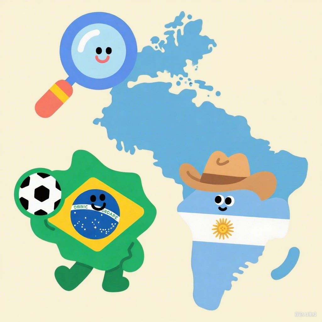
Drag-and-Drop Map Comparison
Move countries freely across the map to reveal their actual size. For example, see how Brazil compares to Canada or how India compares to the United States in real scale.
Realistic World Map
The tool provides a better understanding of land mass distribution by letting you visualize the real size of countries instead of distorted representations.
Educational and Fun
Teachers and students can use the true size of countries map to learn geography in a hands-on and engaging way. Explore interesting facts and surprise comparisons like how Alaska compares to Mexico.
Supports Multiple Long-Tail Searches
Find the accurate world map, true size of countries, or compare country sizes easily. This map is designed for curious learners and map lovers around the globe.
Frequently Asked Questions About the True Size of Countries
Here are some common questions about how our true size of countries map works and why it matters.
What does the true size of countries mean?
It means seeing the real size of countries without the distortion caused by the Mercator projection. Countries closer to the poles appear larger on traditional maps than they actually are.
Why are countries distorted on standard maps?
The Mercator projection was designed for navigation, making straight lines for ships easier to follow. But it stretches land near the poles, so countries like Greenland look much bigger than their true size.
How can I use this map to compare country sizes?
Simply drag one country over another to see how they really compare. You can visualize the true size of countries like India versus Australia or the United States versus China.
Is the true size of countries map useful for education?
Absolutely! Teachers and students can explore geography interactively, making lessons more engaging and memorable.
Can I share or download my map comparisons?
Yes, you can take screenshots or share links to show the real size of countries to your friends or on social media platforms.
Start Comparing Countries Now
Discover the true size of any country in the world